Douglas House
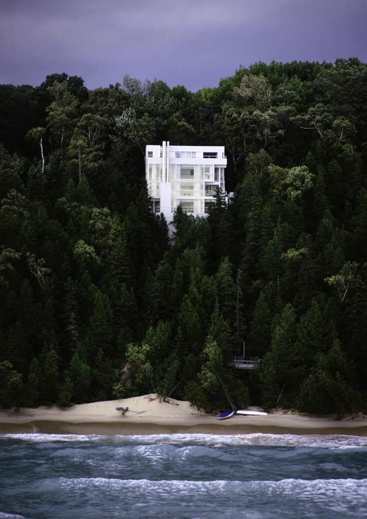
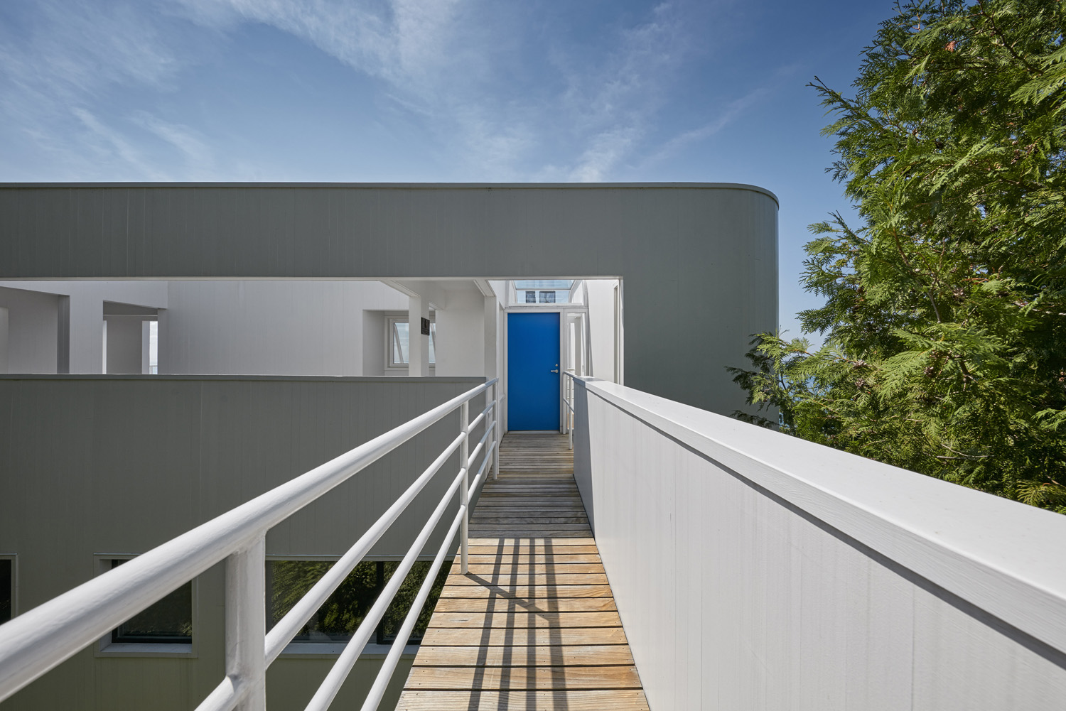
The Douglas House, by Richard Meier and company is situated on an isolated site uphill of the Lake Michigan. The sharp downhill of the land requires the house to have the entrance at the roof level. As a solution for this unique antrance, Meier came up with the idea of a sort of flying bridge. The side which is facing the road, is the private zone, with less windows and more intimacy. The bridge accentuates the space between this wall and the hillside, and seals the private zone from the road.
Almost the entire building, which has a wood frame and a steel column, is painted in white. Once again we find Meier’s love for the color of purity.
Almost the entire building, which has a wood frame and steel column structure, is rendered white.
.
«It is truly a house of opposites: to leave the house for instance, you go up instead of down,»
Richard Meier.
In order to understand more the design we’re talking about, here I leave for you the plans of the house and also some sections of it:


Now that we have introduced this work, we’ll proceed to analyze the form of this building in a more critic way. Every building, no matter it’s size, use, architect, location or whatever, fits in a certain characteristics or for instance is so revolutionary that leaves every rule behhind. Some of this composition rules fits in the Douglas House such as hierarchy, grid, movement, unit, balancing, contrast, color, etc.
Hierarchy
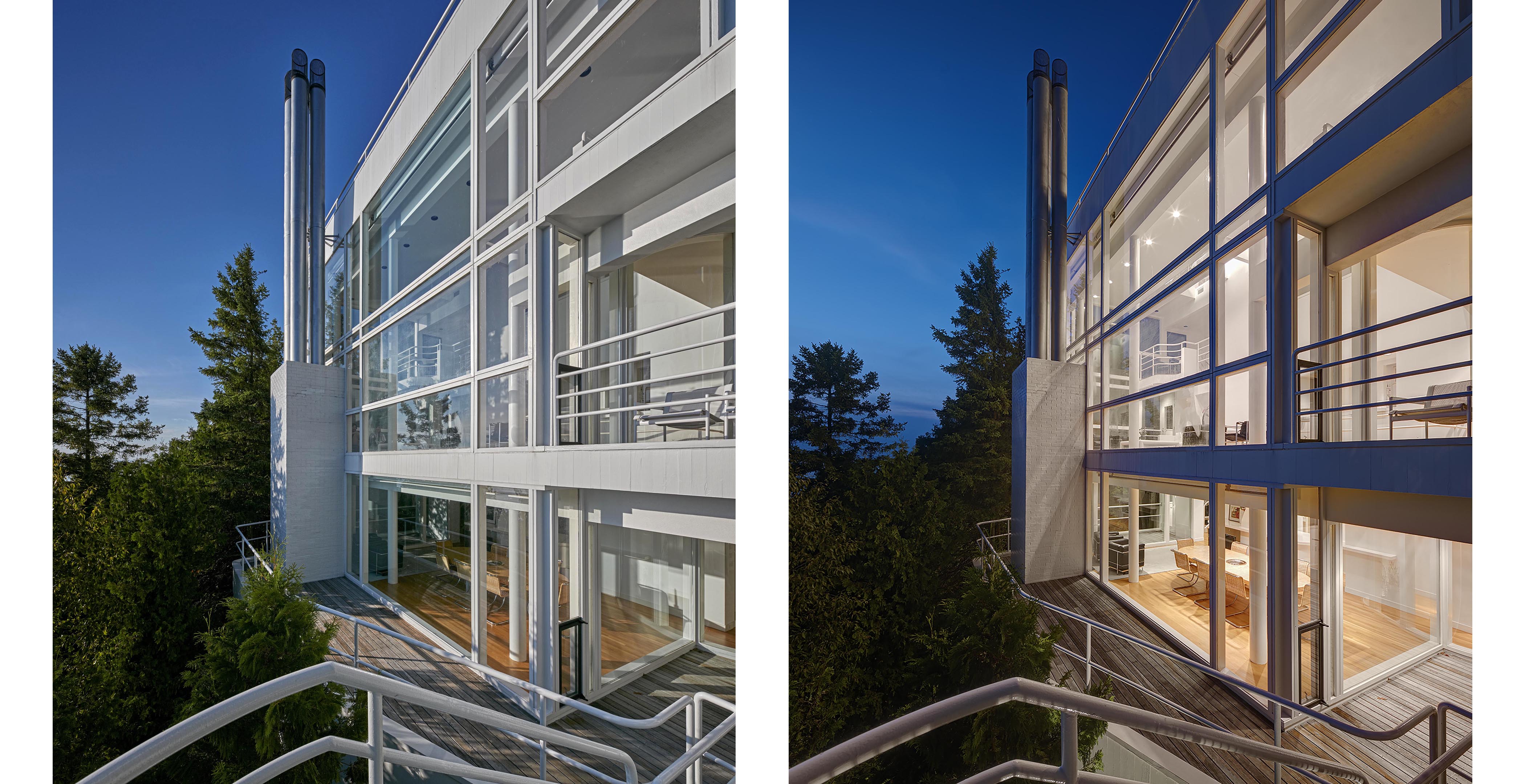
If we study the situation of the Douglas House, we can clearly see a situation of huerarchy, meaning that there existst a supremacy of th building respect the forest. It creates a differenciation between the green of the forest and the pure white of the house, moreover, we can also observe hierarchy in the fact that the house is more relevant in the pictureframe.

Movement
The irregularity of the forms and the forms and the variants of the order inspire the idea of movement, of displacement. Were can we find this characteristic in our example, you may ask? The top floor of the building is built in curves and irregularitis, which brings this flow all over the house.

Also the exterior stairs are built in a curved way, as well as the handrails of the interior. It all gives movement to the construction.

Unit
It is teh relationship of the parts of whole so that nothing should be rermoved or added. In our example we can se that the structure works as a whole, as a «unit» itself. Not just because it all brings a modern look and it’s equilibrated, but also everything has its special function so it can’t be removed.

Balancing
It is the complementary relationship between the elements of the composition. In this case we can clearly see a balance between the materials chosen by Richard Meier are mainly wooden and shiny white. But also you can find some details in black to bring more balance between materials. Using this 3 main materials, the whole house makes sense, it makes a relationship between every floor.
Limit
It comes when there exists an edge between the building and the surrounding. It characterizes by being so noticeable. In the Douglas House, Richars Meier used this resource at least once: in the main entrance of the house, as is shown in the picture bleow.

Light
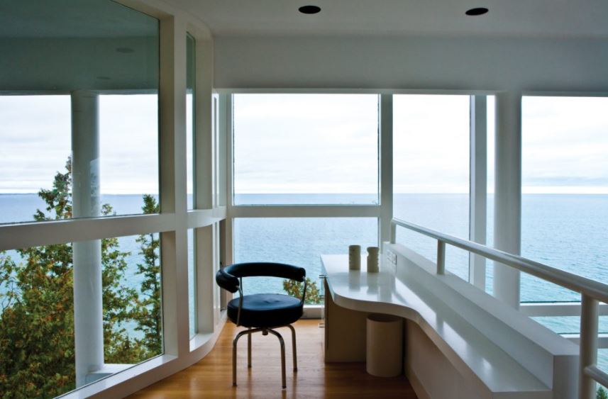
As we all know, lighting is very important in every construction. The Douglas house is bult in a hill which is in front of the sea, so it provides natural light all day long. Moreover, the enormous windows displayed all over the facade allows all light possible to come right insidie.

Contrast
This feature is related with the hierarchy mentioned before. In this case, we study the relation between the facade and the prominent forest. In this example, we can see two types of contrasts:
On one hand we can observe the evident contrast between the color of the facade and the surroundings of the house. The facade is mainly composed by white and windows, whish gives the house a more minimalistic style, however, the forest is dominated by a deep green.

On the other hand, if we take a step forward, we can study the contrast between the nature and the architectural features. Nature is made of random lines, a nonsense. Otherwise the Douglas House is made of straight, paralel lines which makes that much contrast.
Color
This point is easy with this house. In some of the anterior characteristics we have already talked about this. Meier’s style is characteristic for its use of white, and a monochromatic scale. The Douglas House is mainly white with some color such as gray (in some metalic details), and some black in some details.
Texture
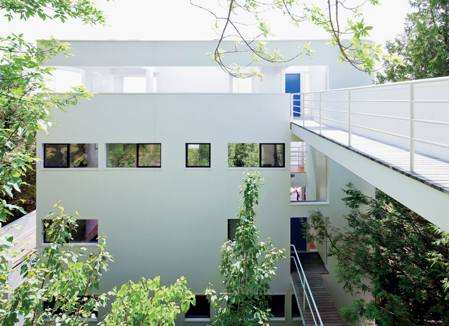
The Douglas House is a simple, linear construction with no much texture other than the white facade and the glass and mirrored winidows. Also some part of the flooring is wood-finished which gives a differenciation with the texture. Also, we can include to the analysis the surrounding of the house, which is a forest with more natural texture, figure and atmosphere.
– https://www.richardmeier.com/?projects=douglas-house-2
– https://archello.com/story/40630/attachments/photos-videos/3
– https://rachelsjones.wixsite.com/rachelsjarchitecture/douglas-house
– metalocus.es/es/noticias/richard-meier-casa-douglas
– http://www.douglashouse.org/
